Elevated User Experience: Google’s Account Switcher Evolution

Google has made refinements to its account switcher on the web, resulting in a notably enhanced visual experience. The act of transitioning between accounts on Google sites lacked a certain visual allure, but the company has diligently pursued the remedy for this. After infusing elements of Material You into the interface earlier in January, along with introducing a gesture facilitating swift shifts between work-related and personal accounts on Android, Google has unveiled a significant transformation to its web-based account switcher.
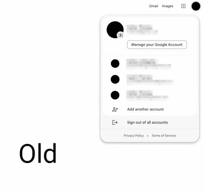
Positioned in the upper-right corner of Google Search, Gmail, Docs, and various other Google sites, the account switcher now features an expandable user interface adorned with a tasteful infusion of Material You. While this change, which centers around accounts, is still in the process of being universally adopted, during our testing phase, it was already operational on the majority of our accounts.

The most conspicuous alteration manifests in the augmented dimensions of the account switcher. Both its height and width have been expanded, imbuing it with a more pronounced presence. The currently active Google Account of the user holds a central position, with the associated profile picture elegantly displayed beneath the corresponding email address. Noteworthy is the transformation of the design of the “Manage your Google Account” button, transitioning from a rounded rectangle to a pill-shaped element. Throughout this redesign, a slightly deeper color palette contributes to an even more refined aesthetic.

Underneath this feature dedicated to account management, users possess the ability to access a comprehensive list of their supplementary Google accounts. This list can be minimized through utilization of the “Hide more accounts” button, resulting in a more compact interface compared to the previous iteration. Unfortunately, this compact view does not persist across various Google sites. Whether one opens the account switcher on a different Google platform or simply refreshes the current page, the list reverts to its expanded state.
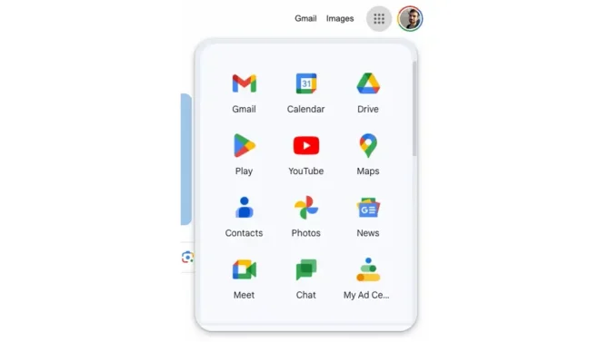
Another significant alteration pertains to the app launcher user interface, accessible by selecting the grid icon situated immediately to the left of the account switcher button. The background of the resulting popup employs the same deeper color palette as the account switcher, with its corners adopting a more prominently rounded contour.
Stay Updated about the latest technological developments and reviews by following TechTalk, and connect with us on Twitter, Facebook, Google News, and Instagram. For our newest video content, subscribe to our YouTube channel.


