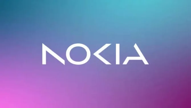
Nokia’s Iconic Logo Gets a Digital Makeover After 60 Years. Nokia, the once-dominant mobile phone brand, has unveiled a new brand identity, marking the first major logo change in almost 60 years. The new logo is a significant departure from the previous design, replacing the iconic typeface and “Yale blue” with a more modern and digital look. According to Nokia’s CEO, Pekka Lundmark, the logo change reflects the company’s updated strategy as a “business-to-business technology innovation leader” focusing on networks and industrial digitalization, rather than mobile phones.
The new brand identity was unveiled ahead of the Mobile World Congress in Barcelona, with Nokia stating in a blog post that the change reflects the company’s new direction. However, Nokia’s phone business has not been part of Nokia since Microsoft’s $7 billion acquisition of the company’s Devices and Services division in 2014. After HMD Global, a company made up of former Nokia executives, acquired the rights to use the Nokia brand for smartphones and tablets, they have been doing their own thing ever since. In fact, HMD Global announced its latest device, the G22, just one day before the logo change was revealed, and it features the classic Nokia logo.
While the new logo marks a significant departure from Nokia’s previous branding, it is important to note that it does not necessarily mean the end of the classic Nokia logo that so many people know and love. HMD Global has not yet confirmed whether they plan to continue using the classic logo for their devices.
Nokia’s logo change is part of a larger trend in which companies are refreshing their branding to reflect their changing identity and values. In today’s digital age, where technology is rapidly evolving, it is essential for companies to stay relevant and adapt to changing times. By changing its logo and updating its brand identity, Nokia is signaling to the market that it is committed to innovation and remaining at the forefront of technology.


